Interior Design
2020
BARRY'S BOOTCAMP
As Germany's first location, the Frankfurt studio of the Californian boutique fitness brand Barry’s opened its doors in 2021. As part of the Global Rollout, the studio design was fundamentally revised and adapted to the location.
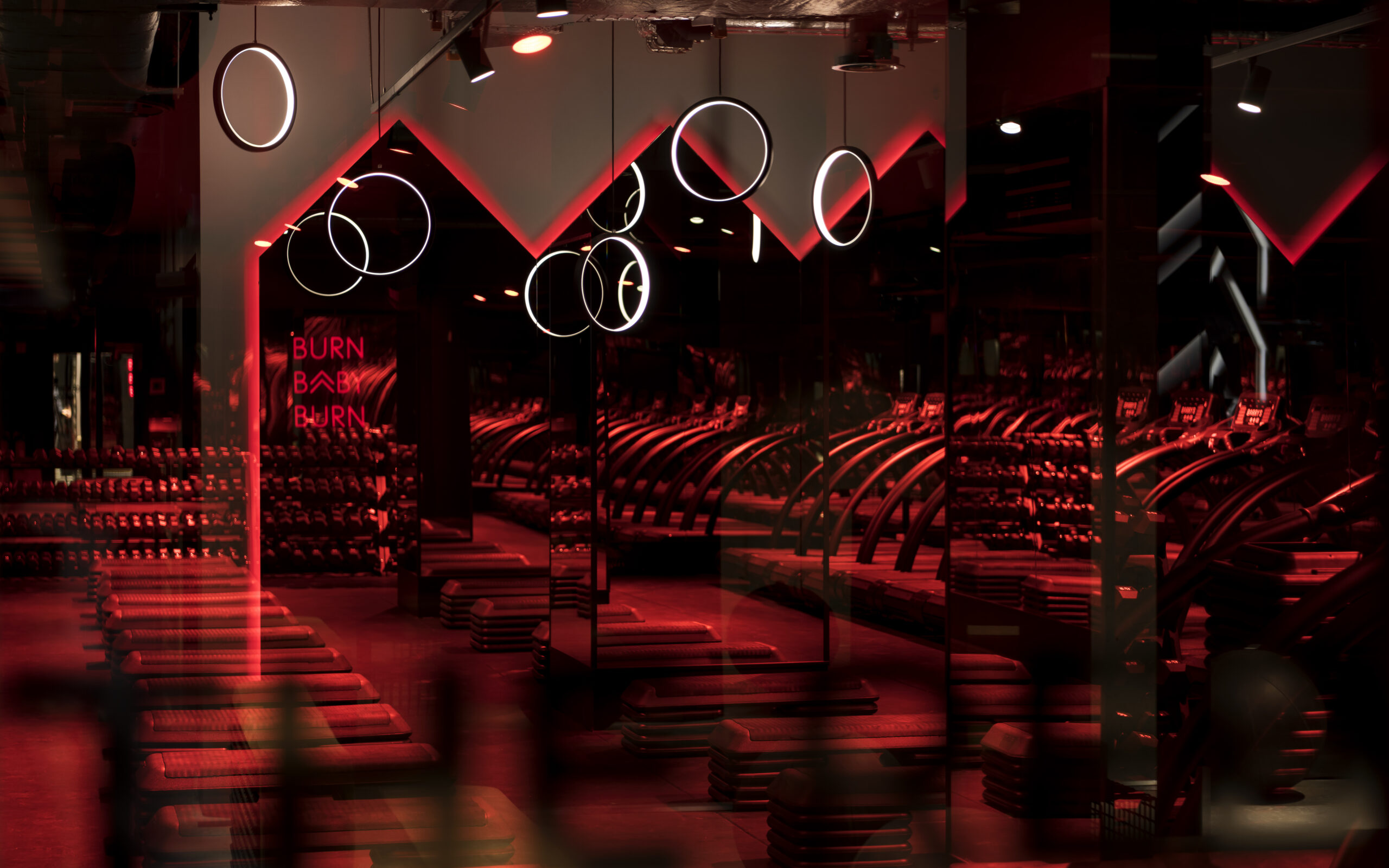
Barry’s stands for demanding HIIT group workouts, that push fitness enthusiasts to their limits in the atmospherically illuminated Red Room . The motivational quotes that Barry's uses to encourage their guests provide the concepts jumping-off point: The devil is an architect and he trains at Barry’s. Following that motto, the bootcamp training hell was recreated as an architectural statement — modern, classy and high-grade.
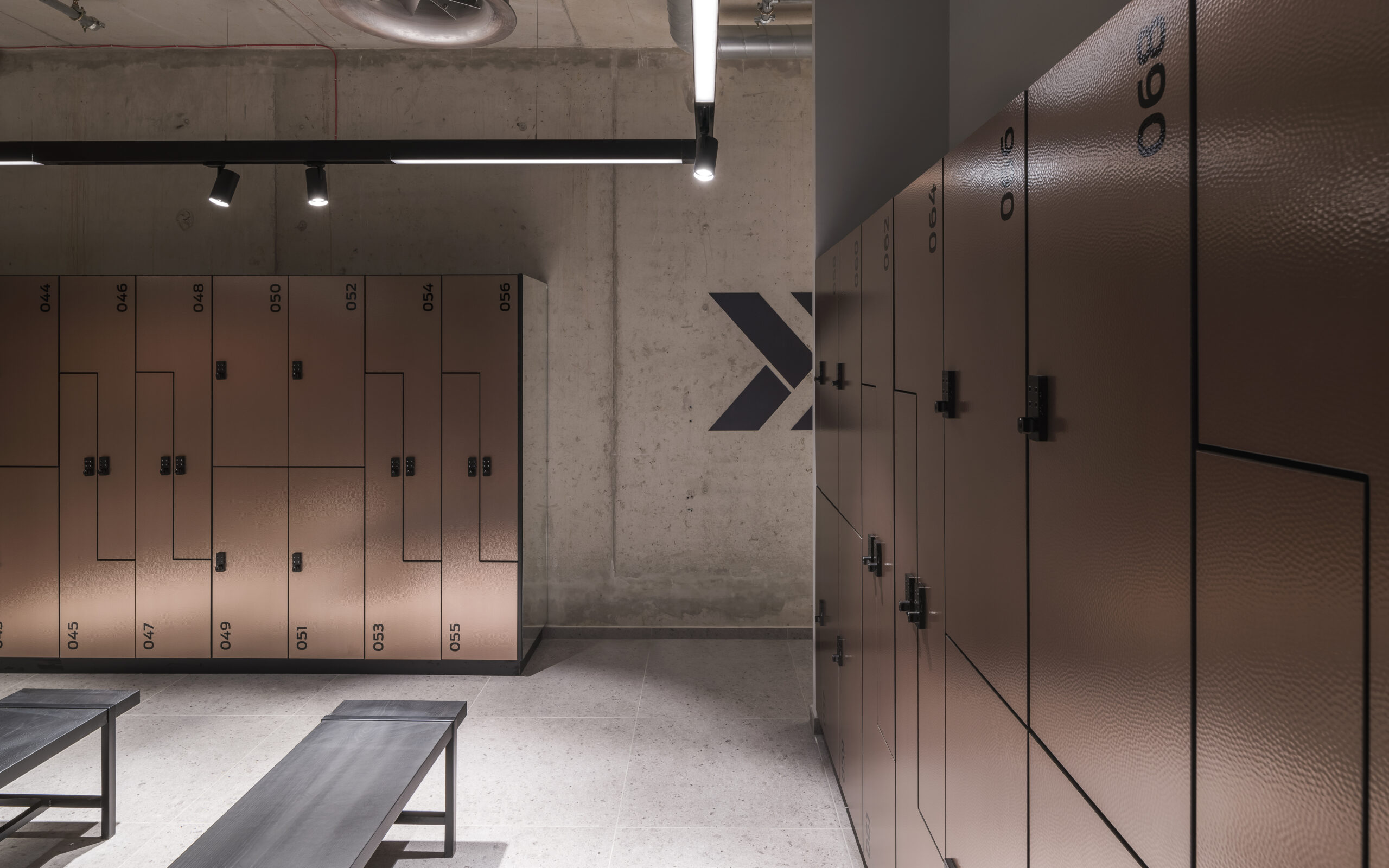
Studio design for the boutique fitness brand Barry's Bootcamp. At Barry's, each location is individual and unique. As part of the global rollout, Germany's first studio opened its doors in Frankfurt Opernplatz in 2021. Many scenic elements reflect the Frankfurt location: high-quality leather and the reflective lighting concept bring the feeling of the city into the studio. The pithy slogans with which Barry cheers on his sports-loving guests form the springboard to the concept: The devil is an architect and he trains at Barry's has created the (training) hell as an architectural statement, modern, stylish, high-quality. This means that the studio can also be used as a brand space for regular community events.
Studio design for the boutique fitness brand Barry's Bootcamp. At Barry's, each location is individual and unique. As part of the global rollout, Germany's first studio opened its doors in Frankfurt Opernplatz in 2021. Many scenic elements reflect the Frankfurt location: high-quality leather and the reflective lighting concept bring the feeling of the city into the studio. The pithy slogans with which Barry cheers on his sports-loving guests form the springboard to the concept: The devil is an architect and he trains at Barry's has created the (training) hell as an architectural statement, modern, stylish, high-quality. This means that the studio can also be used as a brand space for regular community events.
KEY INFO
Date:
2020
Location:
Frankfurt/Main
Agency:
hartmannvonsiebenthal
Client:
barry's boot camp
TASK
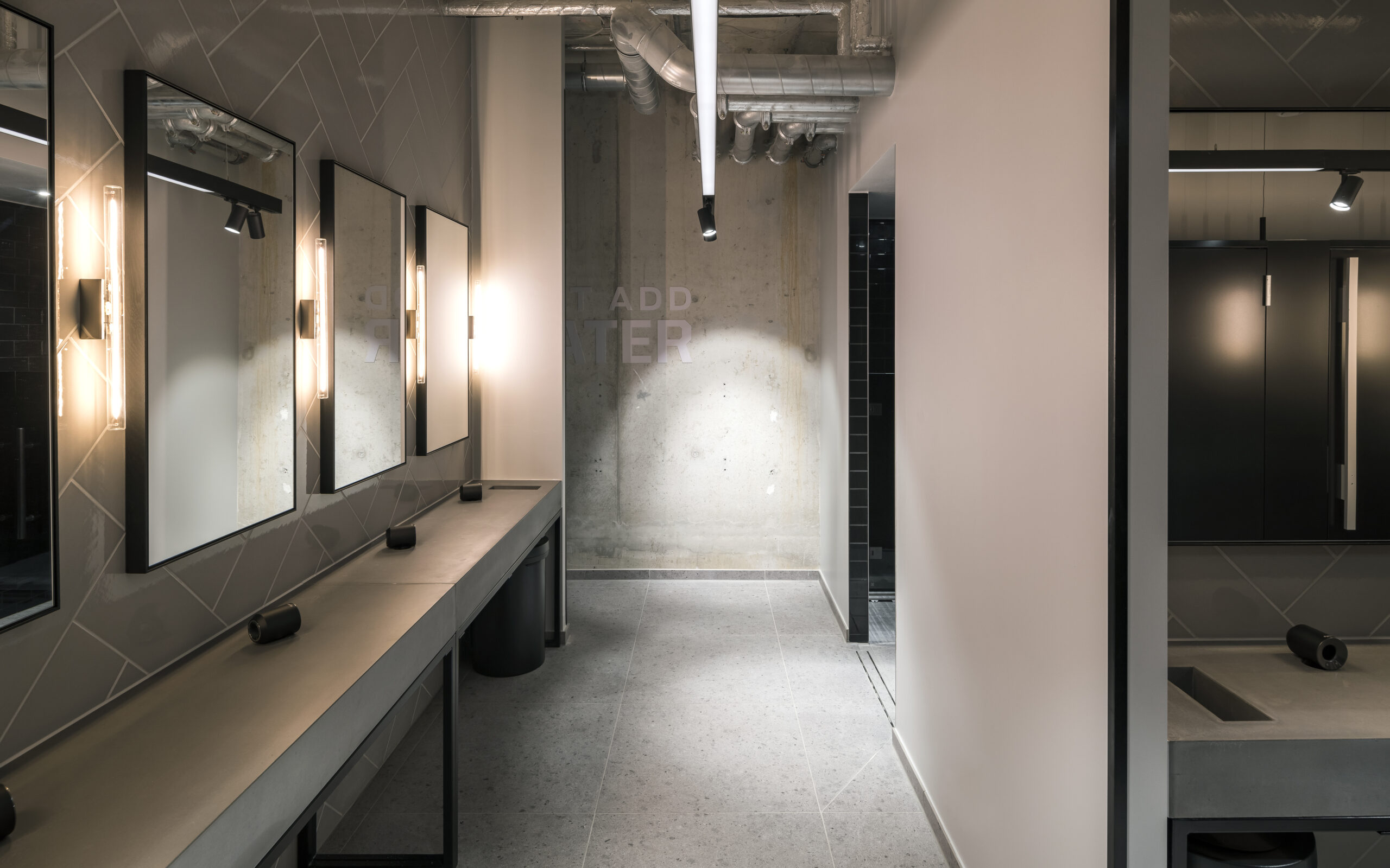
Each Barry’s Studio has its unique interior design, combining the brand's typical industrial style with distinct characteristics of the respective location. The task was not only to quote iconic Frankfurt architecture, but to also translate the value conveyed by the materials of the US design for perception of European guests.
We needed to create a premium class training environment that can also be used as a brand space for regular community events.
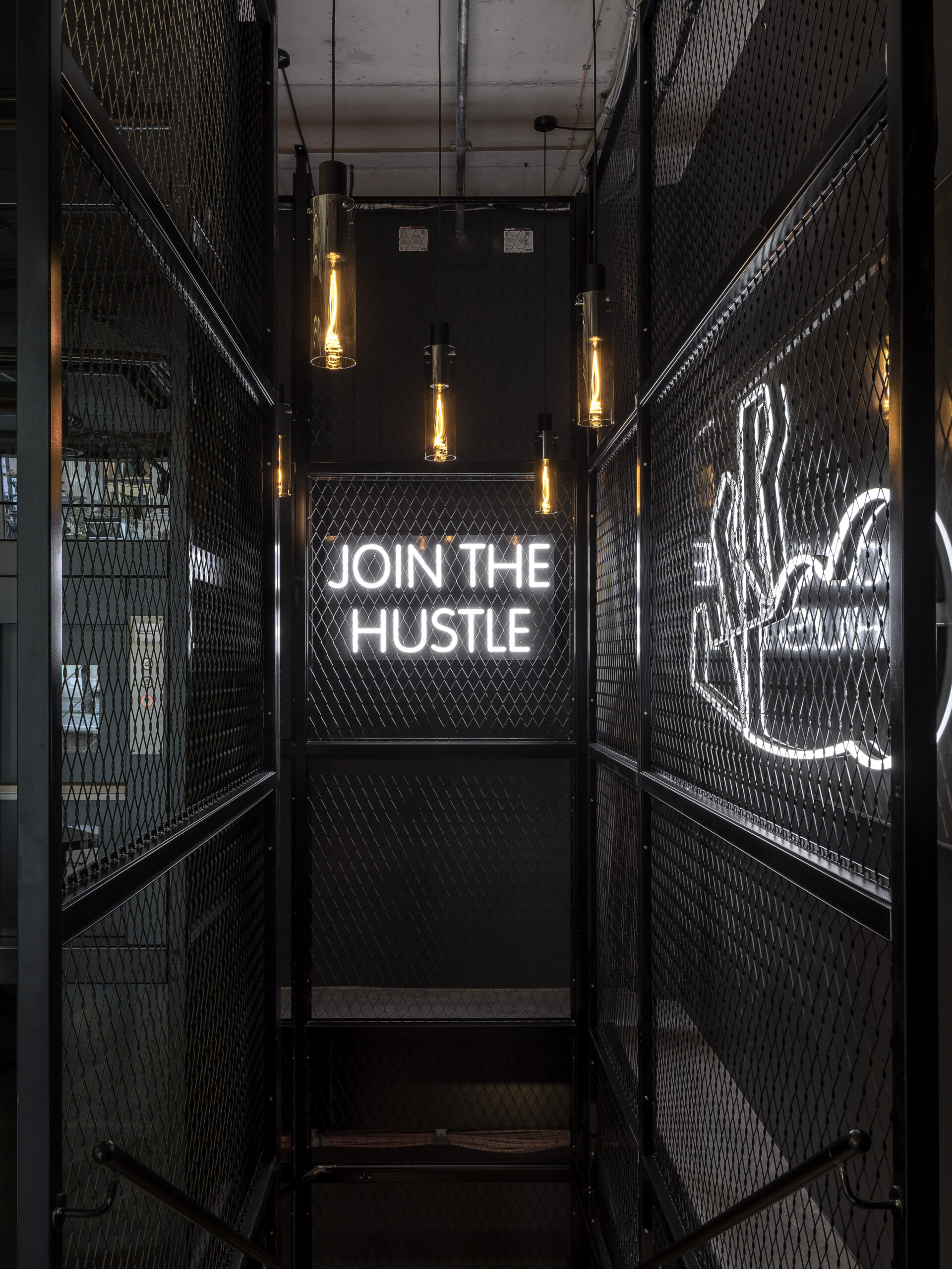
"The devil is an architect and he trains at Barry's."
APPROACH
Localized branding by international brands is always read as a gesture of courtesy and appreciation. Since a rooms ease and cosiness is particularly important for body-related experiences like a workout, we wanted to holistically tailor the interior design to the guests in Frankfurt from the lobby to the facilities.
Unique materiality, furniture, lighting concept and signage increase the customer’s sense of individuality and emphasize the boutique character of the brand's services.
EXECUTION
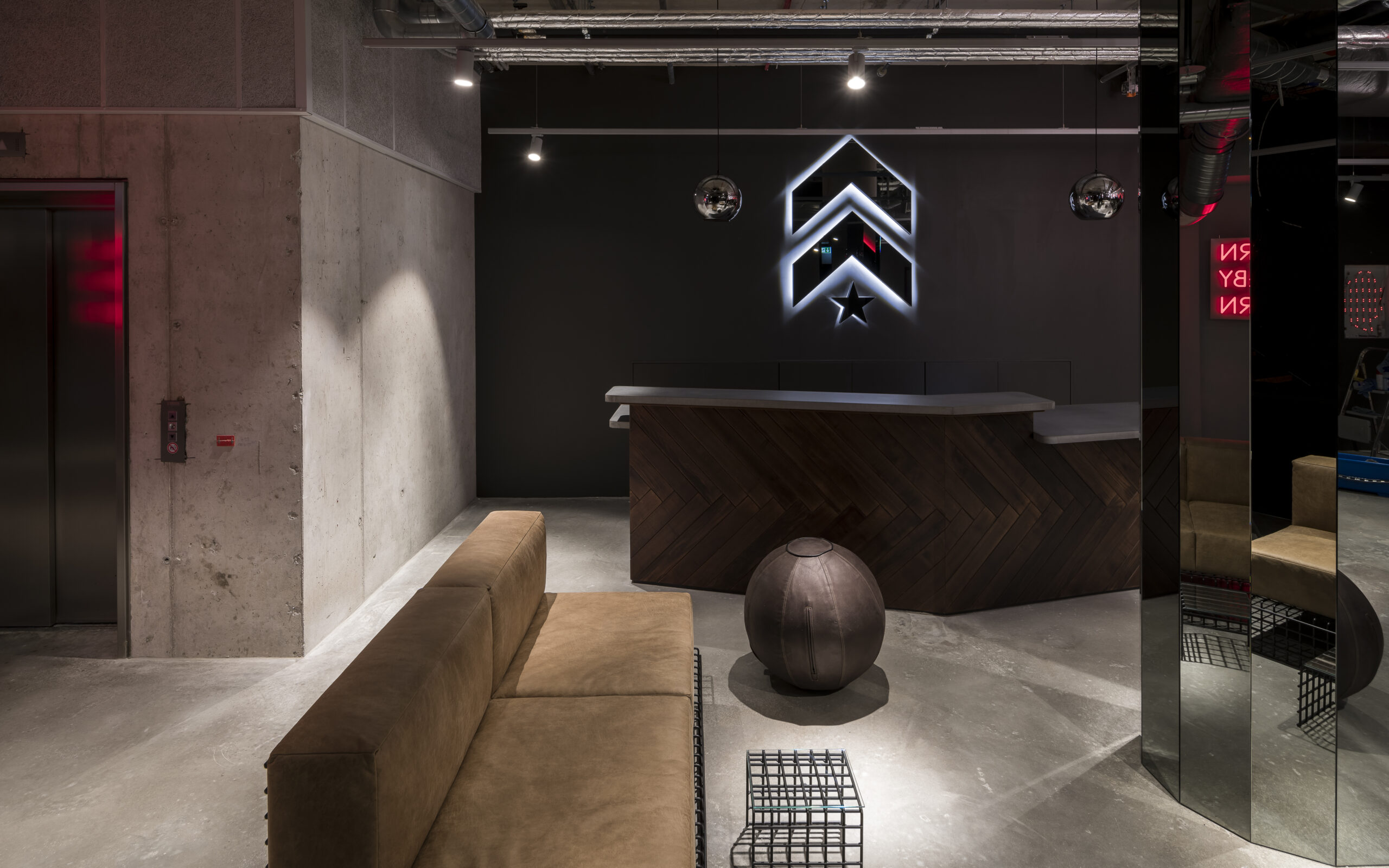
For their signature look, many of Barry’s US spaces feature driftwood and open brick walls. Rusty metal and raw steel is staged by industrial lights to highlight the studios "bootcamp" character.
In Europe unlike in the US, the shabby chic style is no longer associated with premium segment services and spaces. For the Frankfurt interior, we therefore chose materials that embody the industrial rawness, but appear more elegant in their execution. This set's Barry's even further apart from local fitness brands that already incorporate the shabby chick look.
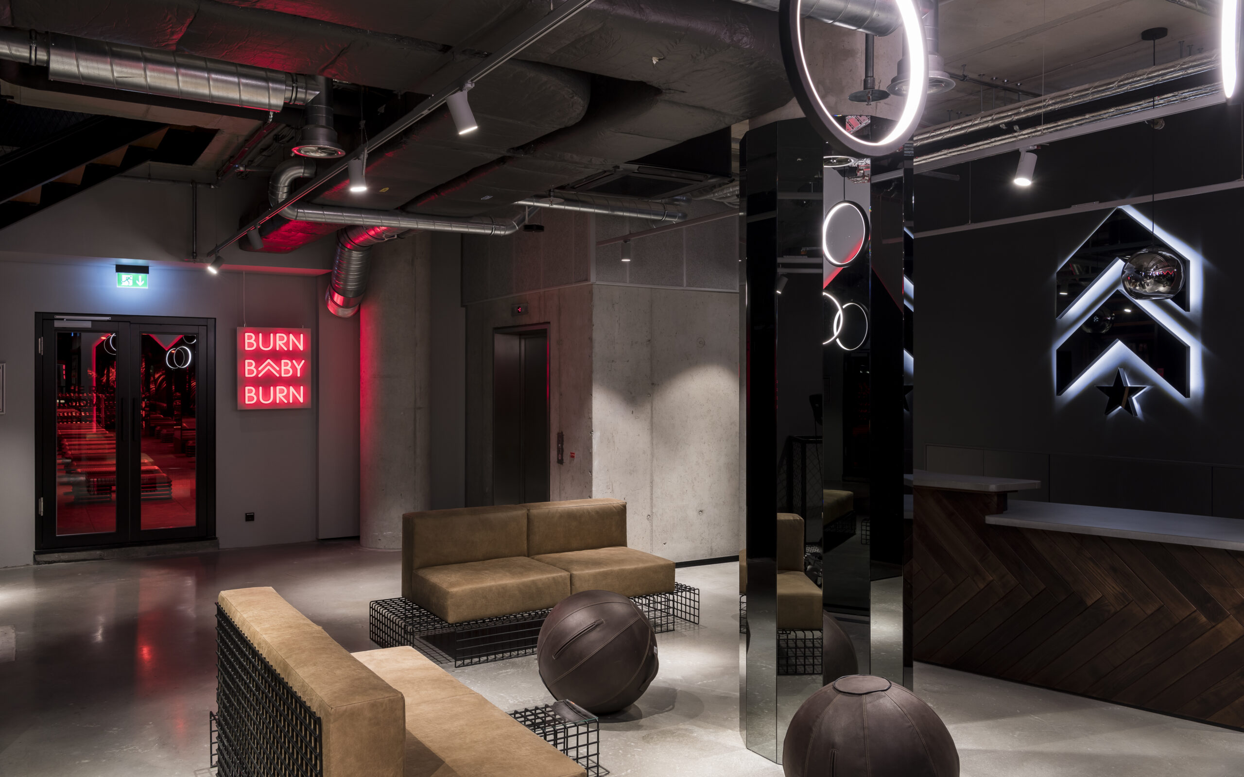
Linear furniture and high-quality leather characterize the entrance area. The counters are clad in herringbone pattern oak, elevating the military insignia origins of the brand’s logo. Smooth polished concrete replaces the brick walls. The bank towers of Frankfurt’s skyline are taken up by many reflective surfaces and powdered metals, which set playful accents through a variety of luminaires.
The ground floor's illuminated interior contrasts the dark and red lit training area of the downstairs Red Room. The contrasting levels create the unique experience of descending into (training) hell.
CONCLUSION
The architectural translation of the interior for German audiences sparked very positive responses and convinced the client. Following this project, we were commissioned to design Barry’s Berlin Studio with the same guiding principles. There, we created a new and unique space that makes the identity of the Californian boutique fitness brand tangible for Berlin guests.
For more info check out here: hartmannvonsiebenthal
Photos by:| Brandspace Photography
Allgemeine Geschäftsbedingungen
3STN. Strategic Design Studio 2023©
+49 (0) 162 81 30 259
hello@3stn.de
